Flavor Around The world:
Food App for travelers
Overview:
For this project, my team and I were tasked with designing and coding a Java application tailored for a specific culture. We selected Russia as our target. We discovered that many Russian travelers struggle with unfamiliarity regarding local foods and their ingredients, which is a significant issue for those with food allergies or dietary restrictions, such as nuts or shellfish.
This is where “Flavor around the World” comes in! Here, our app allows users to input their food restrictions, ensuring the recommended local dishes are allergen-friendly. It considers users’ preferences and generates a personalized list of suitable dishes. The app then highlights the top 4 recommended options, providing detailed information to help users decide if they are interested in the said dish.
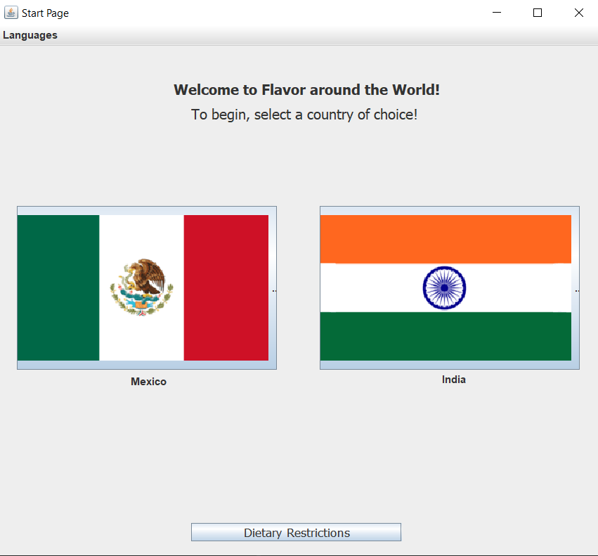
Our app, “Flavor Around the World!”, takes in user preferences and dietary restrictions and recommends foods that meet their dietary needs and momentary desires. The app contains a wide variety of local dishes from both Mexico and India that allow Russian users to find foods that are similar to what they are familiar with. This allows for a wide range of users to be accounted for and needs to be met. The user is presented with their top 4 recommended dishes to try and are able to view more about each dish and learn more about it.
Process:
Research: Hofstede’s Cultural Dimensions
In order to best appeal to our selected culture, we performed high-level research on general Russian culture, collected information gained from testers during usability testing as well as spoke with a few native people from within that culture to best create an application that would meet their needs and wants.
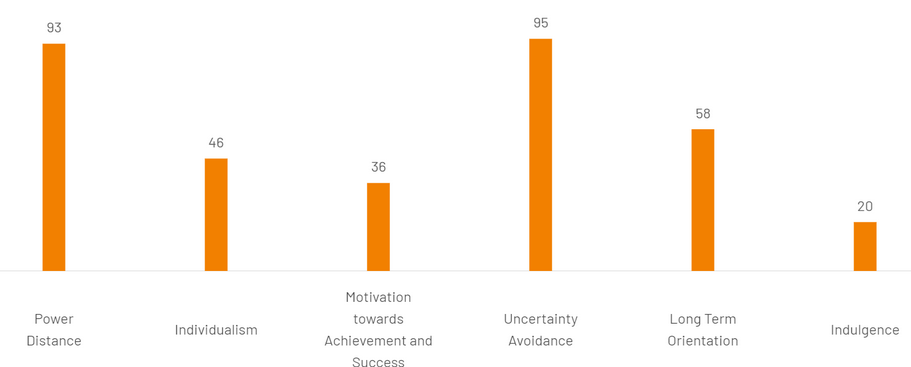
Hofstede’s Cultural Dimensions were used as a framework for the development of our application, with some simple history and geography added for greater context. Through our research, we defined Russian culture as being generally high-context, feminine, collectivist, and having high power distance and high uncertainty avoidance. The high-context and uncertainty avoidance helped us to figure out how much information we needed to include – as much as possible without becoming a cookbook; while user testing helped us identify what information to include – mainly the inclusion of possible allergens, key identifiers of each food, and a general description of the manner in which it is prepared and had. User testing really hammered home the need for allergens in our app. Several non-Russian testers reminded us that allergens were important, while Russian testers reaffirmed that Russians, especially in more recent generations, have a higher rate of allergies than we previously expected. This led us to add allergens as a key functionality of our app.
Additionally, prioritizing the application’s ease of use was essential in the design process. To achieve this, emphasis was placed on creating an intuitive interface that minimized unnecessary complexity. Logical page layouts/sequences and straightforward functionalities were integrated to enhance user understanding. This approach aimed to make the application accessible to a wide range of users, promoting a seamless and frustration-free interaction between computer and human.
Sketches and Planning
Shown below are the sketches & concept art created for our product.
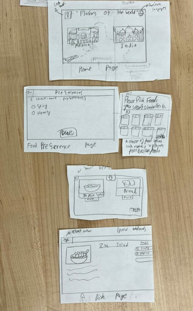
(Sketched layout of the proposed food app)
Flavor Around the World: Food App for Travelers
To the left is an outline of the proposed application that we sketched out. It features a cookbook of the different from various countries, a home landing page where the user can select which country they wish to visit/learn more about the dishes local there, a preferences page where users can select certain ingredients they may be allergic towards, so that the app’s algorithm sorts out foods that contain those foods and removes them form the list of recommended dishes it gives the user. Ultimately, the user can select the dish they were recommended from the country they picked and learn more about the dish itself.
Below is a sample of one of the pages we created for designing the dish page.
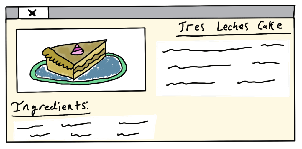
(Concept art of the dish page)
PrototypeS
Several prototypes of our app was created before the final product was fine-tuned to perfection.
Prototype # 1: Bare Bones
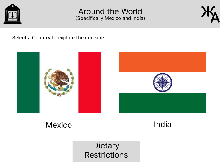
(Ver 1 of Home Launch Page)
Above is the home page of the “Flavor Around The World” App, It features buttons for a cookbook, a language setting, choices between 2 different countries to choose from, and lastly dietary restrictions should the user have certain foods/ingredients they cannot consume.
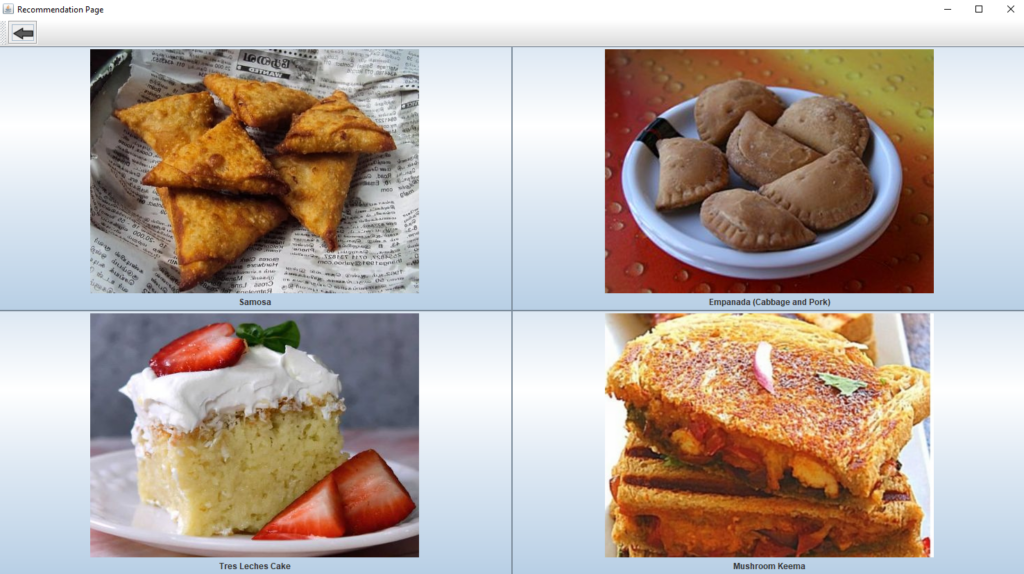
(Prototype of the recommended dishes page)
For the recommended dishes page, we figured that having big colorful photos would be helpful for the user to visualize the dishes and see if they are appealing to them.
Prototype # 2: Functional Prototype
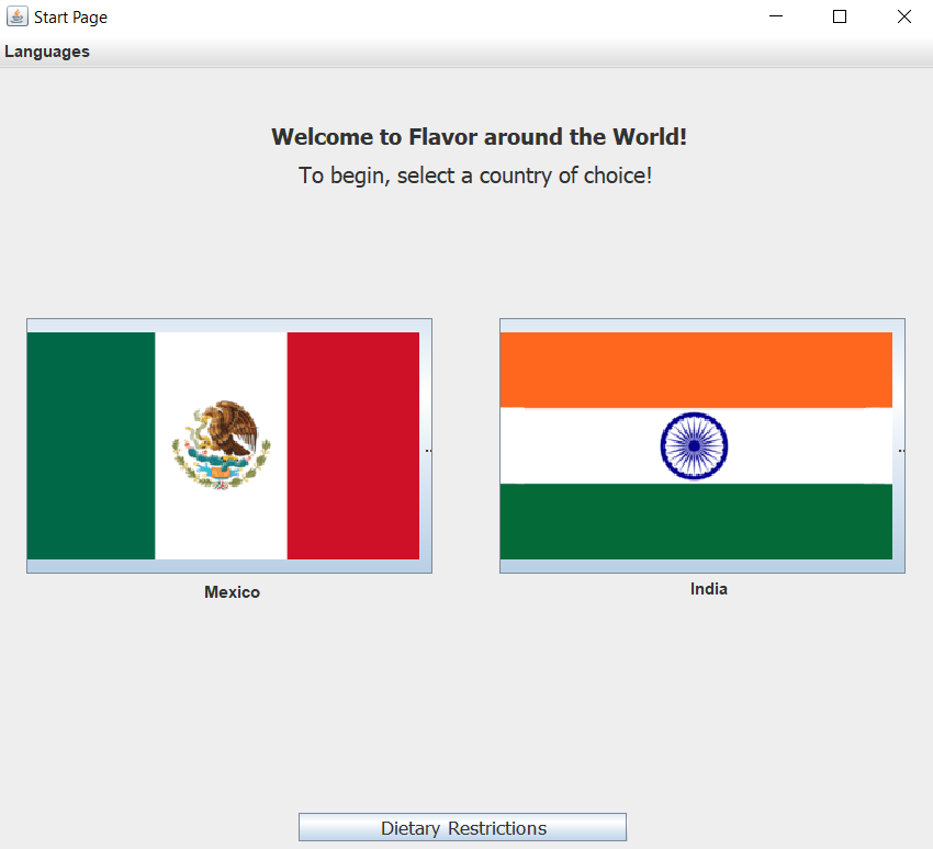
(Ver 1 of Home Launch Page)
For this 2cd prototype, we refined our app’s looks and feels. To simplify the app and reduce unneeded features, we have removed the cookbook element as it was found that most of our user testers really didn’t interact with the feature.
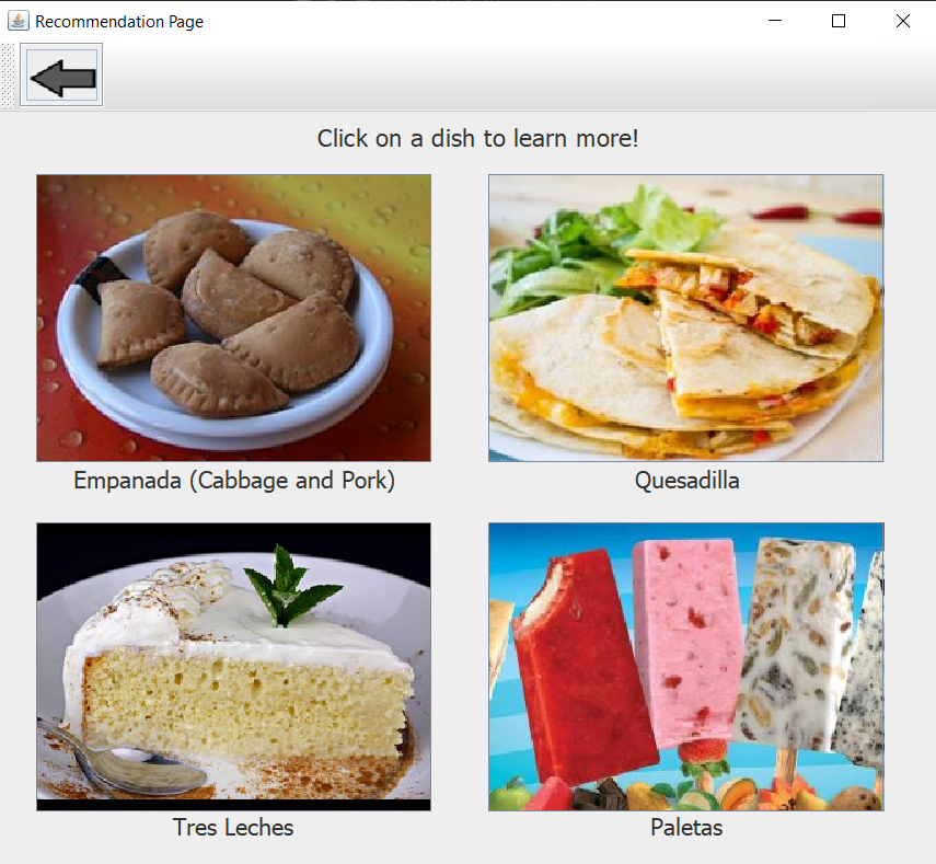
(Ver 2 of the recommended dishes page)
Based on feedback from our user testers, we have simplified the program and worked to ensure that it was intuitive and straight forward to use.
User Testing Feedback
We completed 2 rounds of user testing with both Russian and American travelers to ensure that we were on the right track and were designing our app according to their needs.
round 1:
Relating to our first round of usability testing, our Russian participants favored the way of getting their likes/dislikes through words instead of pictures of foods they knew as a checklist of preferences would be more specific and self-explanatory. Something else we noted from the session was that we need our app to screen for allergies on top of diet restrictions.
Just from our small testing pool three people had major allergy restrictions. Right now the checklist was not enough, so we are considering having an “advanced” or allergens search function. This revealed to us a major opportunity in ensuring a person’s safety as they travel internationally. Indian foods often contain nuts in ways that are not immediately noticeable. Our app can inform the user of this whilst avoiding any opportunity for miscommunication.
Users also had trouble identifying the food repository and language buttons. We will have to experiment with different button icons and possibly labels for users to understand what is available to them in the app. Most people were happy with the size of our elements, finding them generally easy to identify and navigate through, although adding buttons onto the pictures rather than just the text boxes would improve the user’s workflow.

round 2:
For our second round of user testing, we tested with a mix of old and new users this time around to ensure we had a set of new eyes on our app to have a fresh perspective as well as have old users see the progress made since the 1st version. Overall, users seemed pleased with what we had to offer and made suggestions on expanding the dish detail page out more (list ingredients, name of food, longer more detailed description). To better assess our app, we have broken down our feedback into 2 sections.
Functionality:
Something that we learned from our session is that there is a difference in grouping similar words in the USA and Russia. For example, it was discovered that Russians consider “seafood” and “fish” to be separate items, likewise with some other foods. We also had some insight into the daily meals that Russians have and learned that lunch and dinner are generally the same thing for Russians while breakfast is a separate meal all on its own. We ensured to reflect this through our app through means of combining the algorithm to consider lunch and dinner to fall under the same category of “supper”.
Generally the users found the possible preference choices adequate, some thought that the check-boxes should be chunked into related items. It’s apparent that the presentation of the dishes should be more fleshed out: this means including the common ingredients alongside more fleshed out descriptions.
Understandability:
The biggest issue with how well people navigated our app was in back-tracking through the app. Several testers accidentally completely closed the program when trying to clear a pop-up window or were unsure of how to return to a previous page. This back button was implemented later on between user testers we had over a duration of a couple of days. Those that did test with the back button used it heavily and were pleased with it. Otherwise, users quickly navigated the program.
Usability:
There was some confusion once users got the recommendations page, in that they didn’t know to click on a food to see its description. But our biggest point of pride for this round of testing came from the following quotes: “I have an image in my head of what I wanted and the program gave me what I expected”, and “The app is User Friendly”. We are thus proud of this evolved prototype 2 and will continue making improvements to create our final design.
Design & Programing:
Below is a collection of images that track my teams progress of the creation of “Flavor around the world”, starting from idea to virtual, functional application that user could interact with and use.
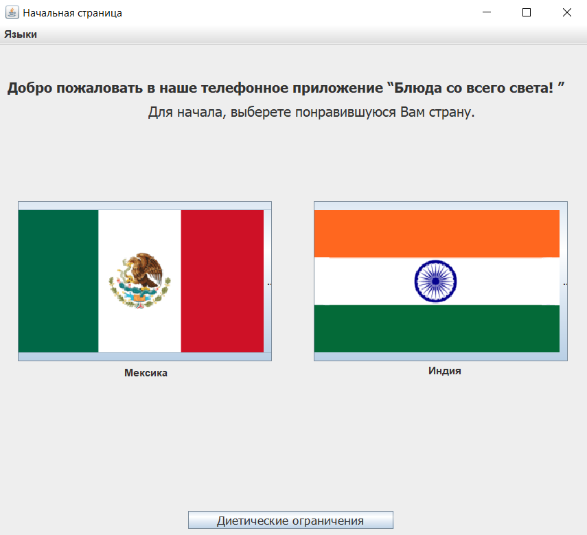
(Translated Russian Page)
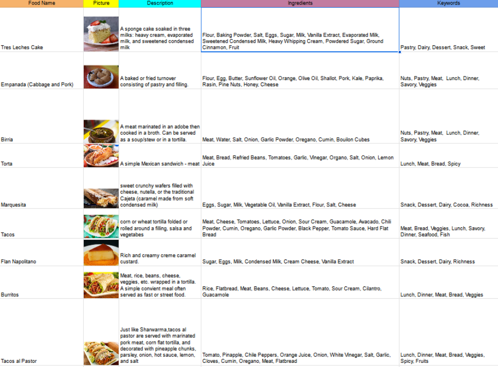
(Food Repository & Ingredients list)
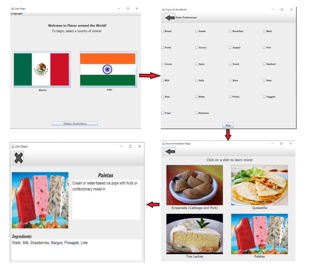
(Overview of “Flavor around the World”)

(Proposed look for the Dish Page)
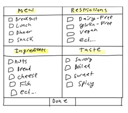
(Concept of Preference page)
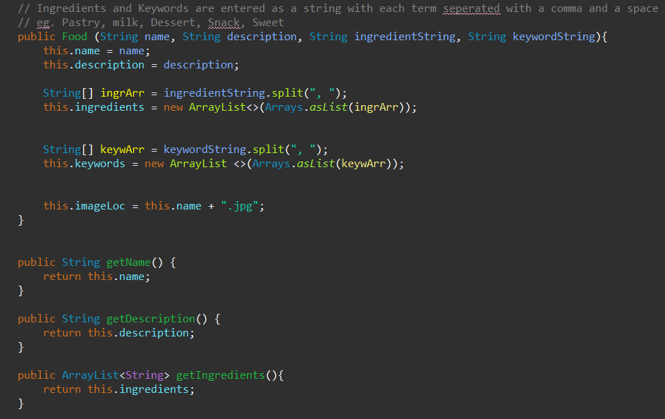
(Sample code for the app’s algorithm)
UML Diagram
Below is the UML diagram of our application, serving as a visual representation used to model and design the structure and behavior of the main system, illustrating how the various classes and features interact and fit together.
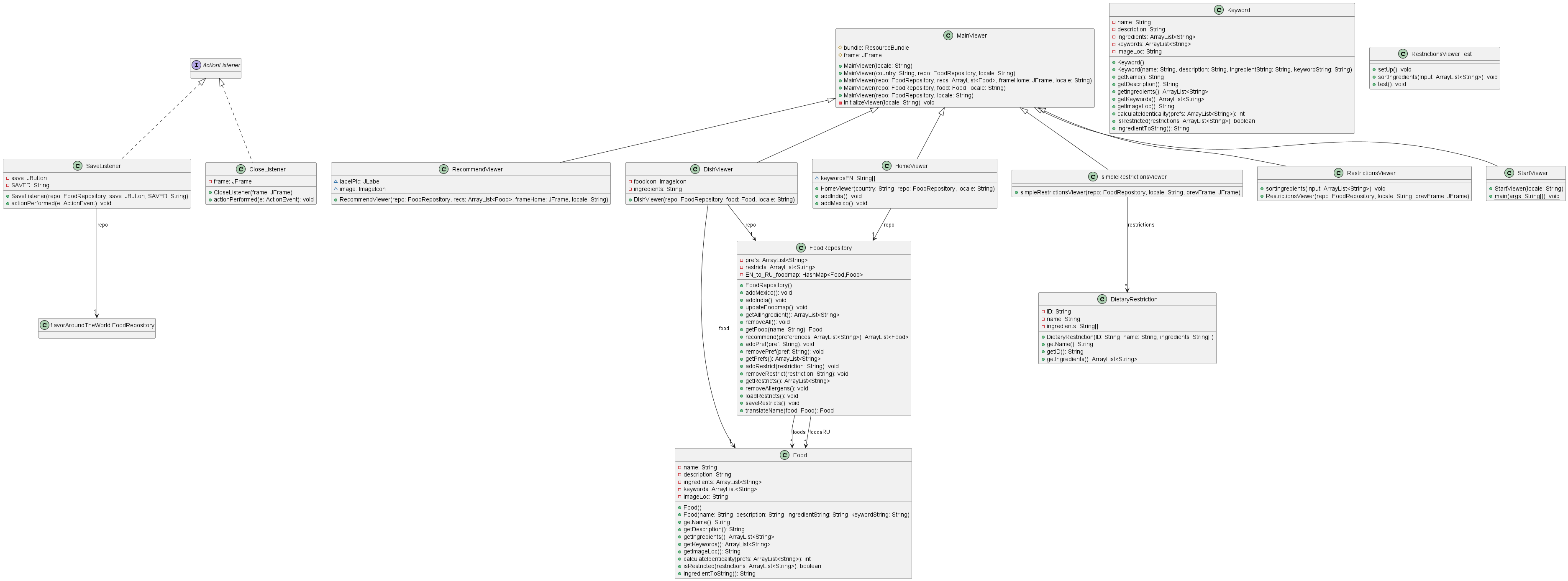
(Complete UML Diagram of “Flavor around the World” application)
functionality of Flavor Around the World:
Below are the official screenshots of our application and the actions the user is able to do and accomplish with the app.

User starts at the Home Page and can choose which country they wish to investigate. They also can change the language settings too.
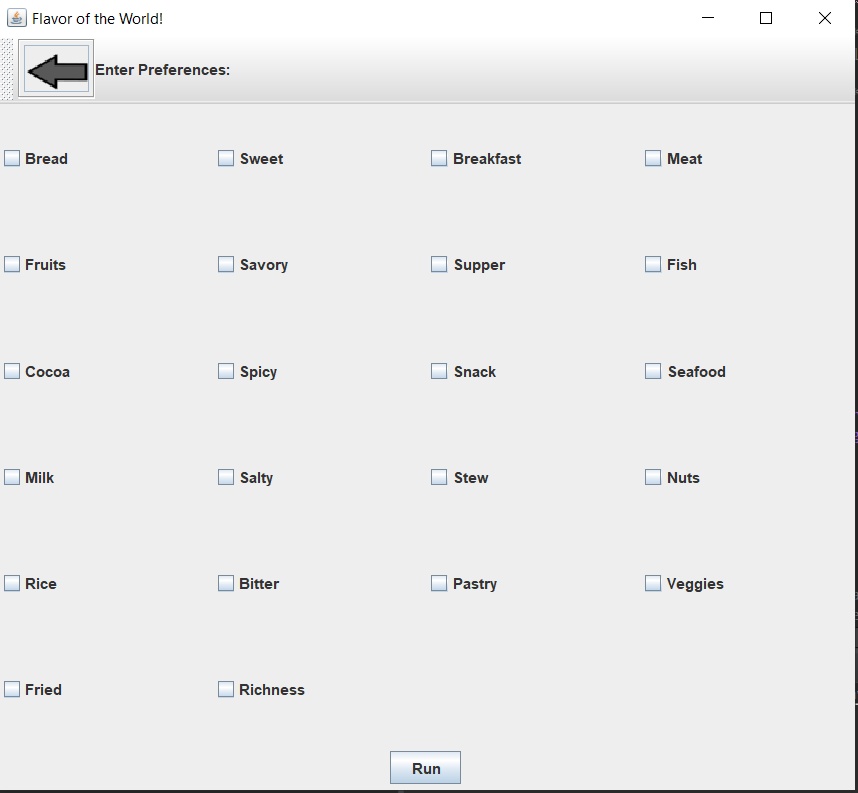
The user is now brought to the Preferences Page and can select what they are in the mood for aka ingredients they want to have in the dishes that will be recommend to them.
 Once the user has selected the ingredients, they are recommended 4 dishes that they can pick from to learn more about.
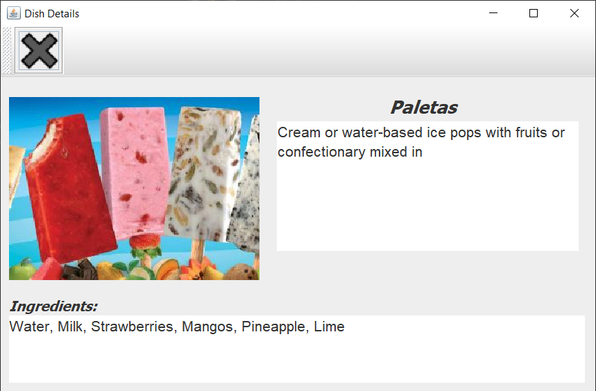
After selecting one of the dishes, the user is brought to the Dish Page where they can learn more about the cuisine they selected and what ingredients it made of.
This can be helpful for those who wish to view all of the ingredients that make up the dish and determine if this would be something they would like to try.
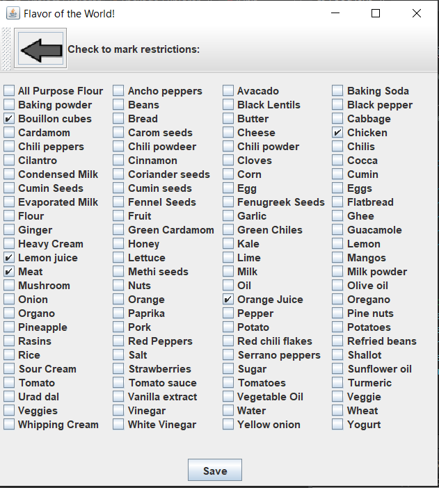
Should the user have dietary restrictions, they can select what ingredients they do NOT want in the dishes that will be recommended to them. This is a full list of all ingredients in the stored dishes the app has.
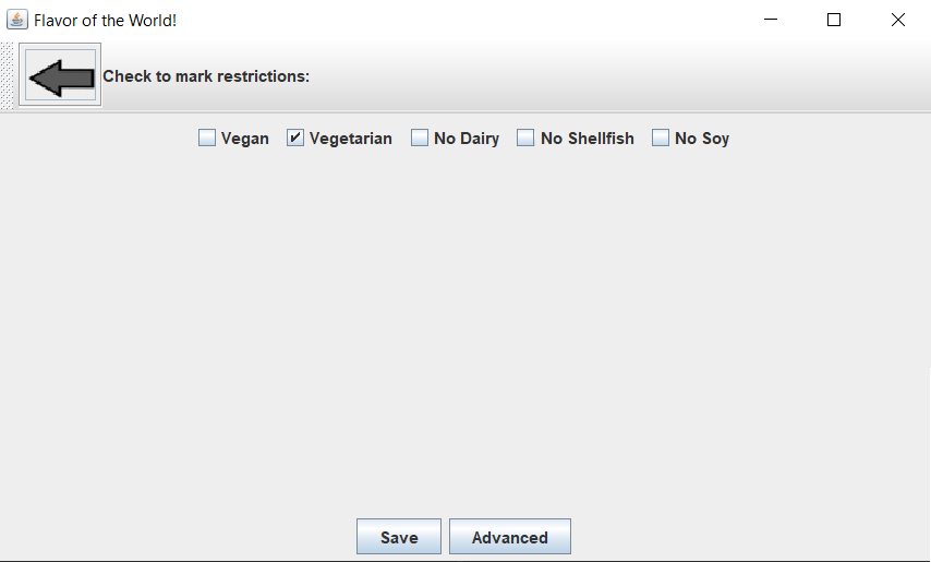
In case the user has certain preferences that fall under certain categories such as lactose intolerant, they can access this quick selection menu to ensure their needs are met in the dishes that are recommended to them.
We wanted this to be a very simple, yet effective page where the user can quickly select some of the common allergies/restrictions that people may have.

Skills gained & takeaway:
- Learned and utilized Java to program the application.
- Carried out usability testing, and high-level research on the culture.
- Practiced developing and working with Human-Computer Interfaces (HCI).
- Utilized Figma to create mock up prototypes of app.
Seeing as this was my last Engineering Design Studio Class, it marked a significant milestone for me, serving as a fulfilling conclusion to the various projects I have collaborated on in the past years. Here, I was able to utilize all my knowledge that I have gained from previous studios to help create a meaningful project and application that can be utilized in the real world for people.
That said, this is not the end of my journey but rather only the beginning of my career as I peruse that of being a Product Designer/Developer. Stay tuned!